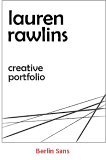
During production of the portfolio front cover, I tried out various different fonts, and selected my favourites to then compare against and choose which one I liked best. The bank gothic light and agency fb appeared quite 'techy' and could have created a misleading assumption on the theme of the portfolio. The one I have chosen, berlin sans, does have a creative feel to it, and obviously being my choice, will again reveal something about my personality.


No comments:
Post a Comment